Effective Visual Communication of Big Data
The goal of data visualization is to communicate information clearly and efficiently to users via the statistical graphics, plots, information graphics, tables, and charts selected. Effective visualization helps users in analyzing and reasoning about data and evidence. It makes complex data more accessible, understandable and usable.
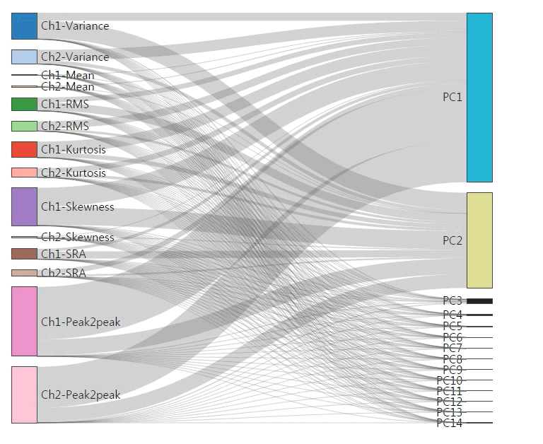
Visualization Method of PCA Algorithm
Principal Component Analysis (PCA) is a widely used algorithm for high dimension data analysis. In a machine health monitoring system, a result of dimension reduction using PCA is often visualized. Other information is not presented because it is difficult to understand and interpret to users. However, it also contains important information for data analysis. In order to assist the user in better understanding and interpreting PCA, we have developed a system that visualizes the results of PCA using javascript library, D3. This system can intuitively visualize key information of PCA result.
Korea import/export data Visualization (demo site link)
Daejeon Ta-shu (public bike rental system) data Visualization
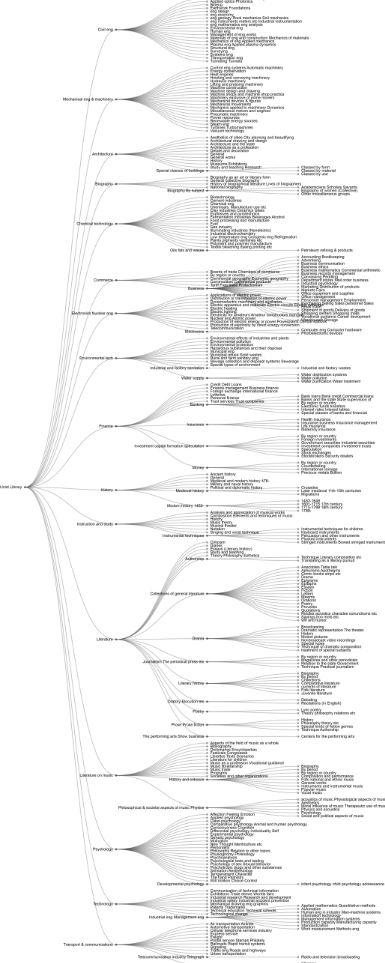
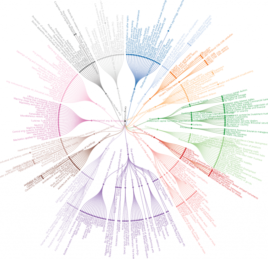
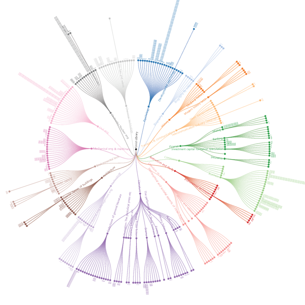
UNIST Library Data Visualization
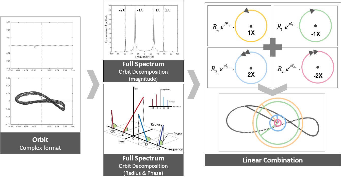
Effective Visualization for Rotating Machinery Monitoring Systems
An orbit can be presented as a sum of two circular orbits: one is the locus of the vector rotating in the direction of rotation (forward), and the other is the locus of the vector rotating in the opposite direction (reverse). Both vectors rotate at the same frequency (the frequency of the filtered orbit).